As a creative artist and designer, immersing myself in the world of color is one of my happy places. It’s like soaking in a pool of warm water where I always emerge refreshed and invigorated.
One of the beautiful excursions I take into the world of color is through the portal of the European color site, ncscolour. Throughout this article, you’ll see color referred to by its European spelling, “colour.”
NCS has already begun to focus on color trends for 2025, which you can see by visiting their site. But today, let’s delve into the unique and inspiring 2024 Colour Trends, which NCS has separated into four categories; Young Folk, Wood Kick, Heart / Stop, and Star Gazer.
Enjoy!
TREND DIRECTION
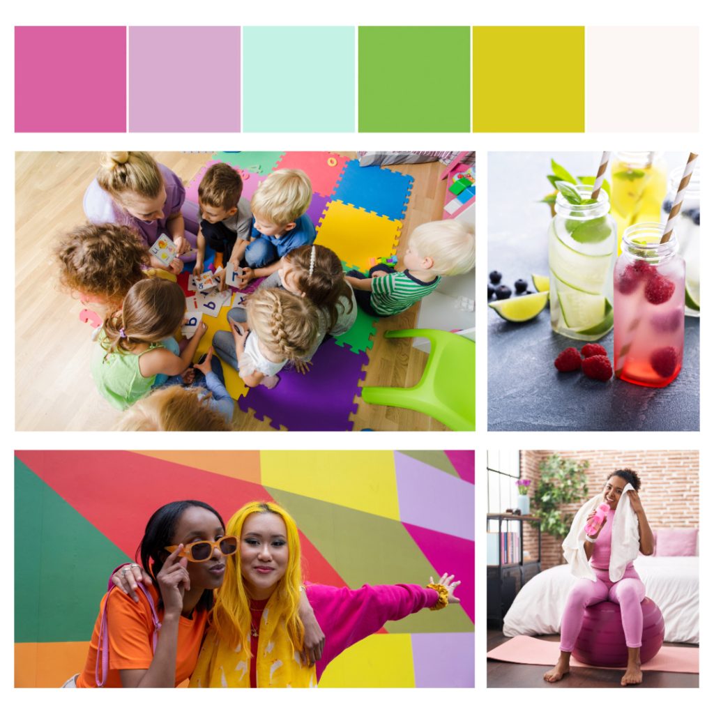
Young Folk
Bold and happy colours of pink, a greenish yellow and a green that make our surroundings feel like a folkloric eco-verse. These chromatic colours are balanced with soothing, beautiful pastel shades that calm us down and make us feel comfortable. We want to indulge ourselves in a positive environment where things are not static and boring. White is a necessary balance colour here.
TREND DIRECTION
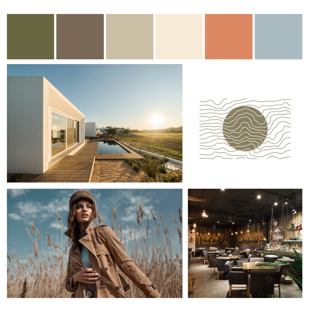
Wood Kick
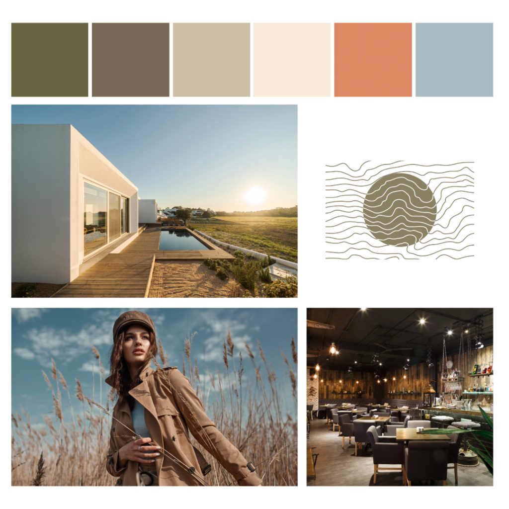
Natural, raw colours found above, in, and below ground give us the necessary feeling that we are correct. This feeling of correctness is boosted with a tint of a warmer, natural, happy colour that fills us with the energy we need to face a new normal. It is a manifesto for conscious sustainable living, where there is no room for artificially coloured things. We use the natural colour the material has.
TREND DIRECTION
Heart / Stop
Pure red generates a sense of urgency or importance. Red indicates attraction, passion, and action. Red nuances want to live together with a reddish blue. The chromatic red and blue are balanced with warm grey concrete and wood. This constellation of colors is classic and poly-national; it invites us in with feelings of recognition and understanding while at the same time indicating bold actions.

TREND DIRECTION
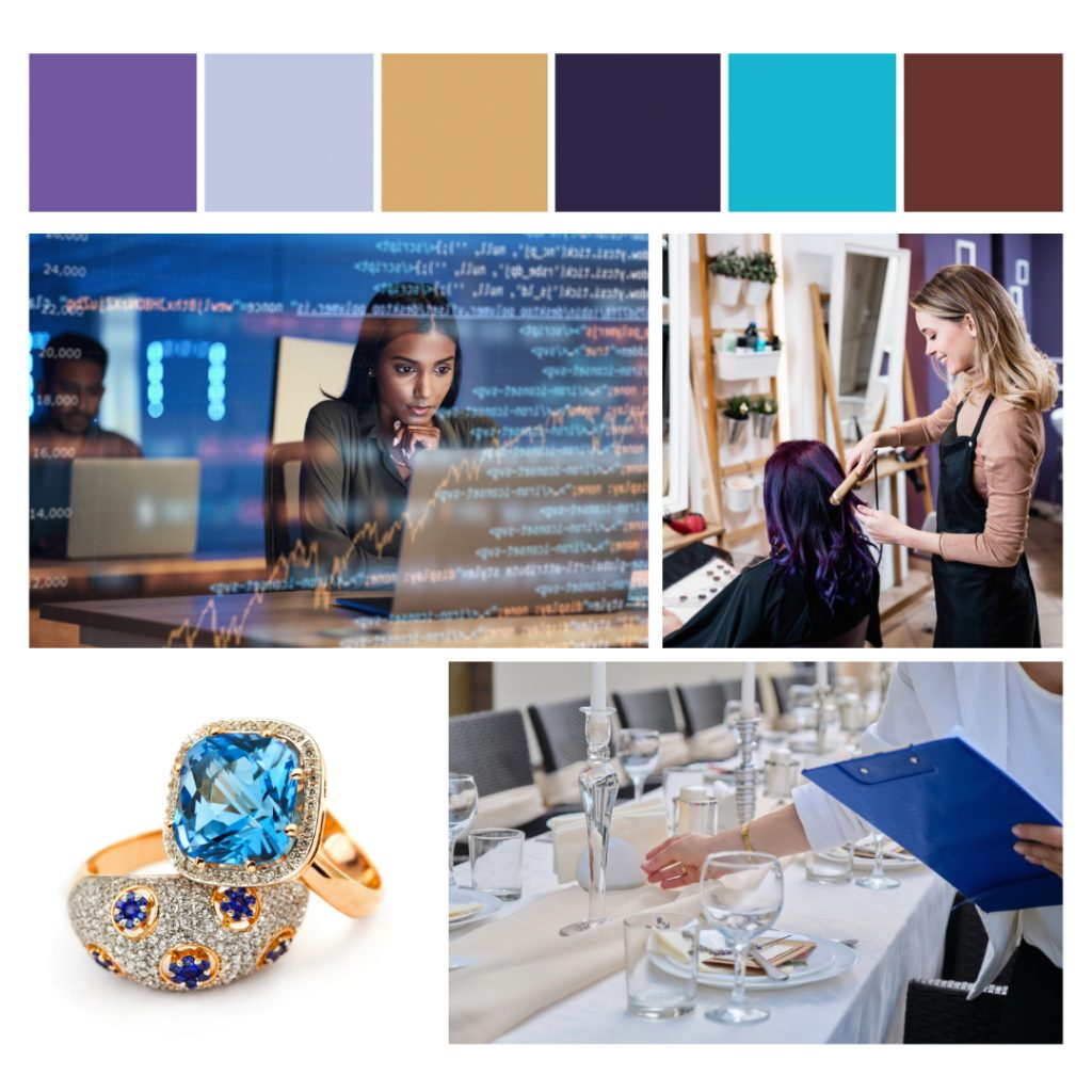
Star-Gazer
We escape into a powerful kaleidoscope of mysticism with a base of purple and violet. Together with darker-tinted colours and the very important gold, they introduce us to a mindset that we want to understand who we are, or rather who we would like to be. The colours are elegant and exclusive. Combining darker-tinted colours or purple and violet with gold surrounds us with a sense of wealth in all senses.
